Workout Wednesday Week 8 - Merimekko Chart
tableau WorkoutWednesday Merimekko
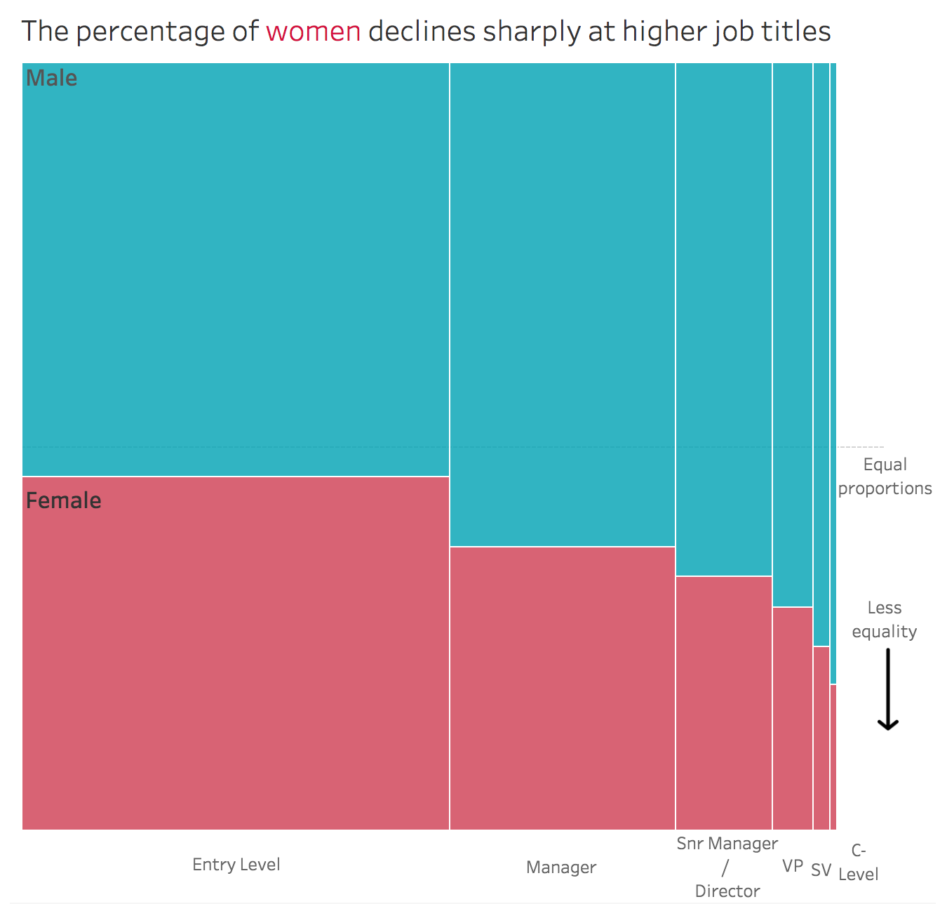
This week’s Workout Wednesday was given by Emma Whyte to recreate the below makeover of Junk charts in Tableau in the form of Merimekko chart.
This was my first time creating the famous Merimekko chart. As suggested by Emma, I went through Jonathan’s Drummey excellent tutorial on Merimekko Chart. He had given a step by step process for the same. I read the blog once, and decided to create the chart on my own then. Out of everything, the calculation for x-axis seemed most challenging.
Emma had given the following rules for the viz:
- Show the 50% point of equality as a grid line
- Dashboard size to be 660 * 650 pixels
- Add on the direction of less equality
- Label the columns of the Marimekko to match hers
- Label the first two segments Male and Female
- Make sure the tooltips match hers
I downloaded the data and started with the process of creating a cross tab first to get the calculations right.
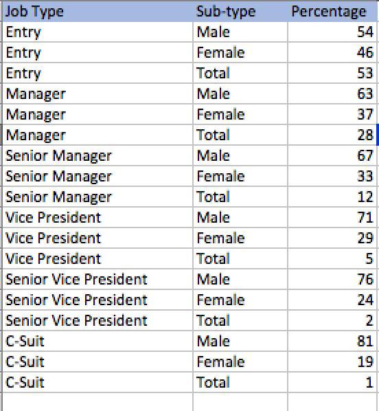
Looking at the data, these were the steps I listed down to follow:
- Extract Female percentage and sort Job Type by it.
- Extract “Total” value for every Job type
- Count a running sum of “Total” value to get x-axis marks for every job-type
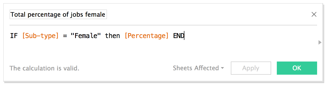
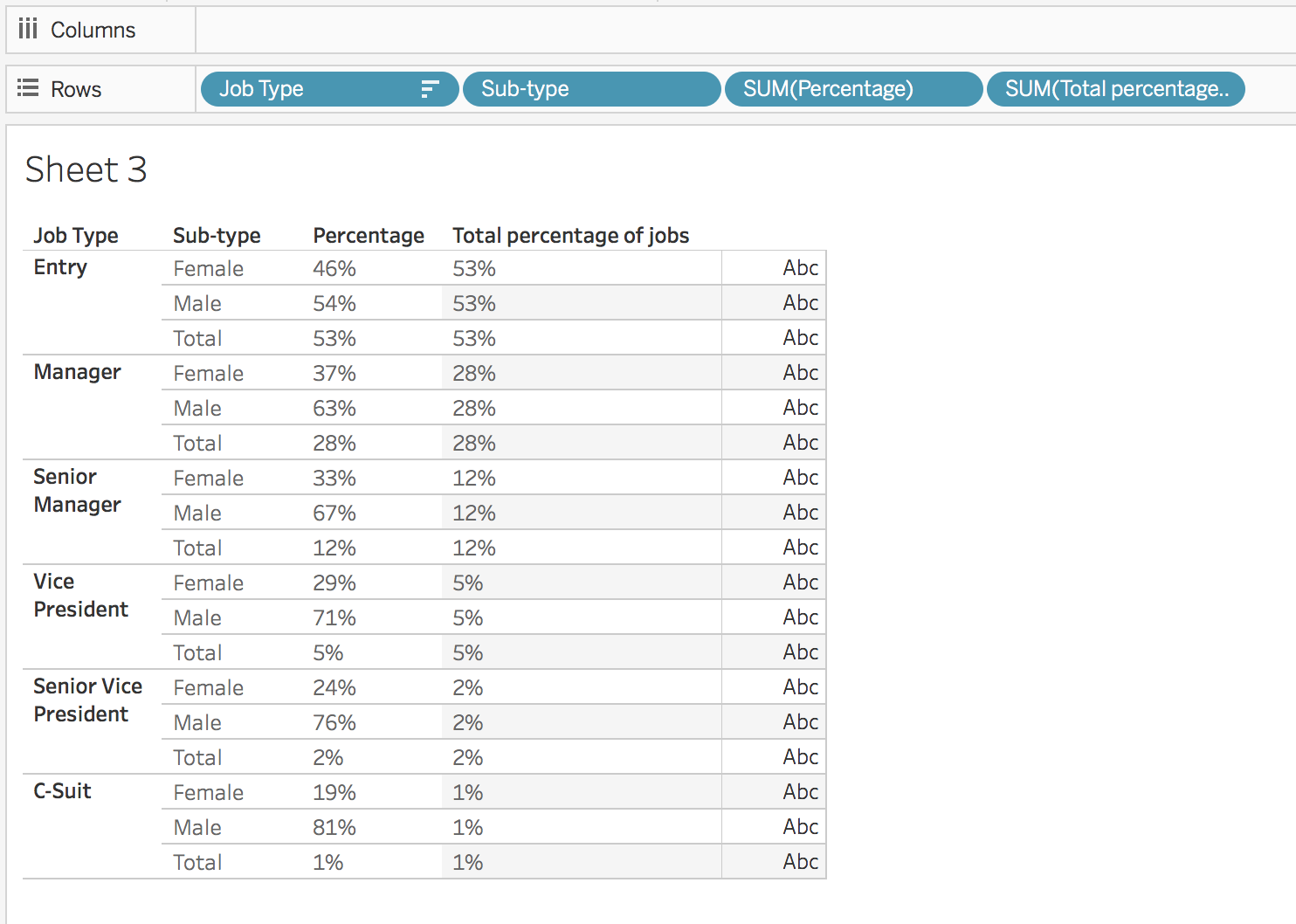
Extracting Female percentage for every “Job Type”
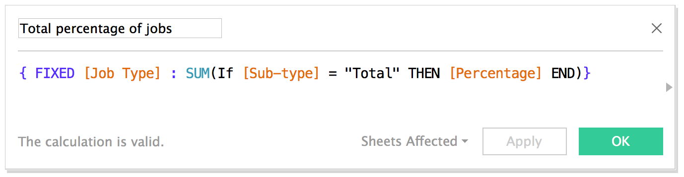
Extracting “Total” Value
I did this by doing an LOD calculation.
For every “Job Type”, extract the value of “percentage” when the “Subtype” is “Total”
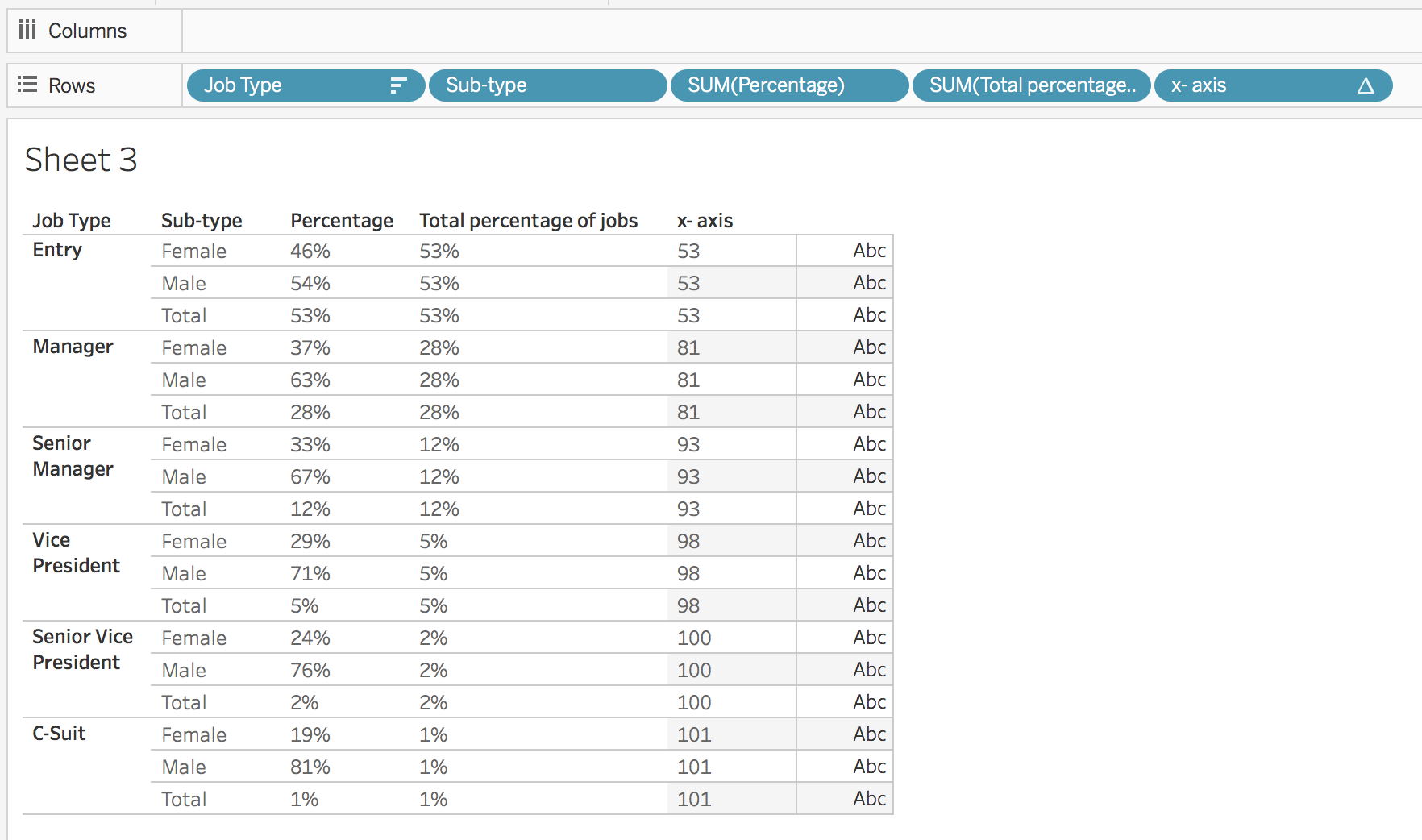
After putting these two calculations as dicreet on the row shelf, this is what we get:
Count a running sum of “Total” value to get x-axis marks for every job-type
What I want now is to increment Total Jobs value only when the “Job Type” changes. We use a simple calculation to do that.
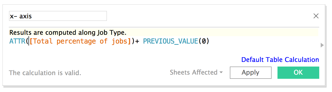
This is how the above expression is working:
- For the first row, since we passed 0 as an argument in Previous Value(0), it becomes ATTR[Total % of Jobs] + 0.
- To understand the part ATTR[Total % of Jobs]: Note that even MIN, MAX or even SUM function will also work here. The reason is that the computation expects that we are working at an aggregation but there are no aggregate functions used here. It turns out that every row will become a mark. Since each mark corresponds to only one row, we can use any function MIN, MAX, or SUM.
- Now until Job Type changes, i.e. for first, second and third row, we need 0 as previous value. This is easily achieved by setting compute using to Job Type. Thus this computation results 53 for first, second and third row.
- Lets move to fourth row. Here Job Type changed from Entry to Manager. Here Previous Value(0) remembers the value of the computation done last time which was 53; Thus the expression becomes ATTR[Total % of Jobs] + 53.
- This computation will remain same till fourth, fifth and sixth row, until Job Type changes again.
- And yo, we have it!!
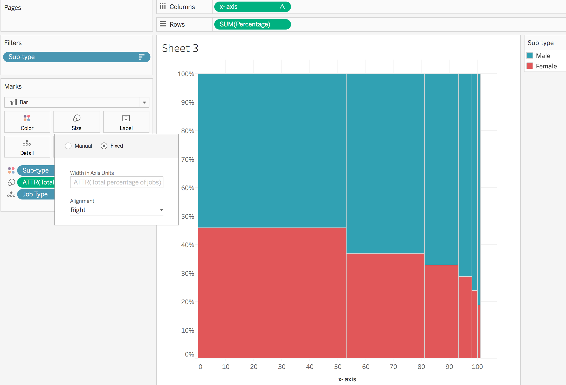
Now the calculations are in place, let’s plot the graph:
- Put Job Type on Detail shelf and sort it descending by Total % of jobs Female
- Place the x-axis pill on column shelf and change it to continuous (Remember its Compute Using is set at Job Type
- Place SUM(Percentage) on rows shelf (Again any aggregate function like Sum, Min, Max, Average can be used here) and change it to continuous.
- Move Sub-Type to color shelf. Also put Sub-Type on Filter and Exclude “Total” value from it. Now the bars will be divided into Female and Male percentages.
- At last, put the ATTR(Total % of Jobs) on Size shelf so that the width of the bars is set accordingly (Again any aggregate function like Sum, Min, Max, Average can be used here). Change the size control from Manual to Fixed and make it right aligned. (Note that the fixed control option is available only when the axis is continuous. So if the x-axis is set to discreet, we wont be able to change the size to fixed.
All this will get us here:
With a bit of formatting and labelling we get the Final Dashboard:
- I created a separate sheet for the header so that I can also highlight specific Job Type by clicking on it
- Equal proportions and Male, Female labels by reference lines
- Floated rest of the text and the down arrow image.
The final dashboard is as below.
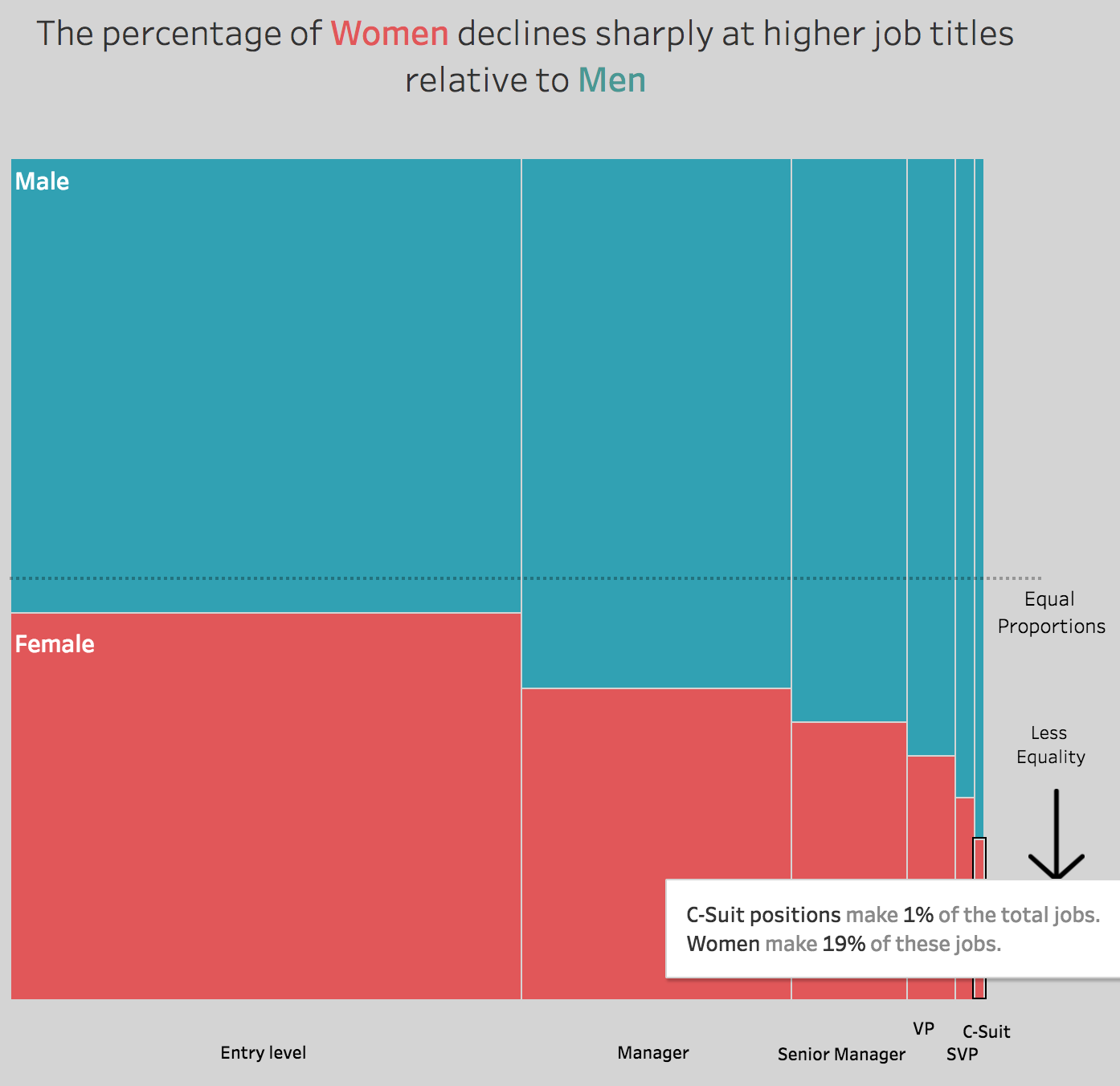

tableau WorkoutWednesday Merimekko