Workout Wednesday Week 5 - Distribution bands with Medians
tableau WorkoutWednesday distribution-bands
Whenever Andy Kriebel (@VizWizBI) posts a viz for #WorkoutWednesday, the viz looks so sleek and perfect that my first thought always is “oh man, this is going to be tough”. And very obviously I get stuck somewhere and end up looking at somebody’s dashboard for solutions. But this time I decided that I’ll not take a peek into anybody’s blog or tableau workbooks until I give my 200%. So I did just that :)
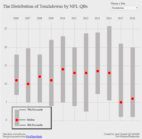
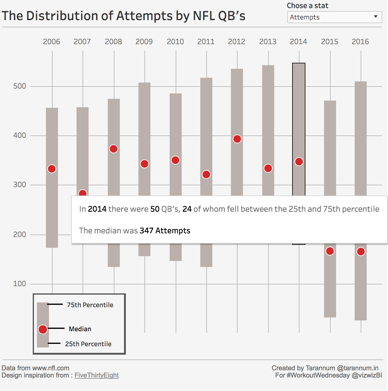
This week’s challenge was to recreate the below viz created by Andy Kriebel using NFL data
And these were some specific requirements :
- All of the elements must be floating on a dashboard sized 650x650.
- You cannot use the Player dimension anywhere in the view.
- Match my colors including the background
- Create the legend (HINT: It’s not an image)
- Match the tooltip (Note the stats that are displayed in the tooltip. This will be a bit tricky. Essentially you need to count the number of players that are contained within each band.)
- The viz should update based on the stat selected. The user should be able to choose between: Attempts, Completions, Interceptions, Touchdowns, and Yards
- The title should update dynamically based on the stat the user selects.
- Optional: Use Montserrat font (you can download it from Google fonts)
My initial thoughts were:
Things which seem easy at this point:
- Chart shows Percentile distributions so Box plot should do the main part
- Parameter control and dynamic heading- lots of practice in previous workout Wednesday exercises
- Gauging appropriate range for dashboard and making everything in fixed place is always a lot of work so fixed size and floating elements look like a relief
Things not so easy:
- Tooltips don’t look too daunting for now but are giving an uneasy feeling :)
- I have never experimented with custom font. If time permits I may play around with it a bit
- Legend (which is not an image). I assume this is going to be another sheet plugged in the dashboard. But not going to be straightforward.
With these thoughts I loaded the data, created union so that all sheets come in one place and fired up 1st sheet.
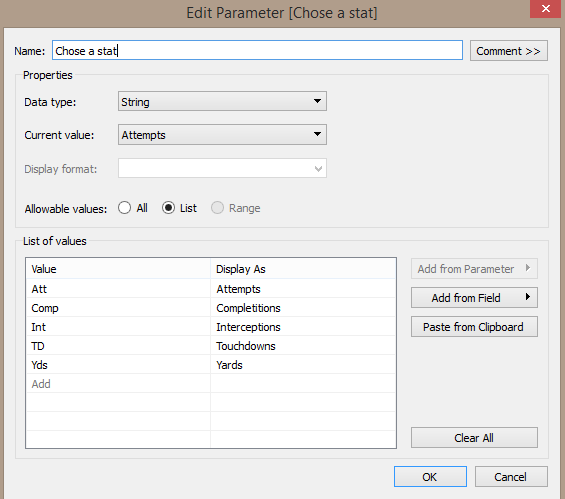
Easy things first, I created a parameter control with string data type for choosing the stats.
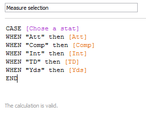
And then proceeded with accompanying calculation to reflect the values of the chosen stat in the viz.
After playing around a little with box plots and not able to do much with whiskers i started to realize that box plot is not going to do it. Those bars must be some type of bar chart or gantt chart sized according to the interquartile range.
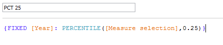
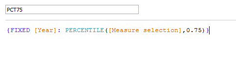
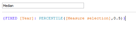
So, to get IQR first we need 25th percentile and 75th percentile of the required measures for every year. Also the medians. I did those with LOD calculations.
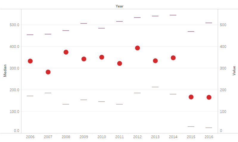
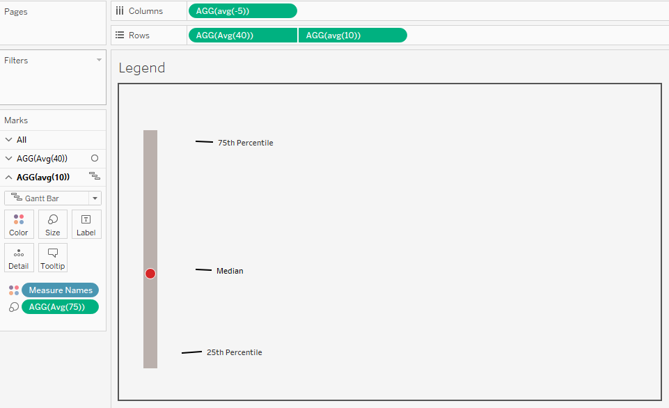
After getting all these in place, I got something like this. with median and 25th and 75th percentile displayed.
Now it was only a matter of joining the percentile marks. But I just could not get how. I got stuck in this place for a LONG time. looking around for articles on quartile range, box plots, custom bar chart and what not. Now in the hindsight it seems so silly.
I eventually stumbled upon the idea that we can use the difference of 75th percentile and 25th percentile to set size for the gantt chart and no need to display the 75th percentile in the view. So I did the calculation, moved the median marks to front and instantly achieved this.
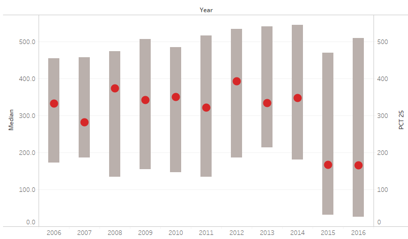
WHAT?? That looks so neat. Was it this simple? Have I done 90% already??
I was so wrong :)
Anyways, after celebrating for a while, I went on to tackle the tooltips. I started with the thought that it is going to be tricky. But surprisingly it did not take me much time and worked perfectly. Hopefully I am not missing anything.
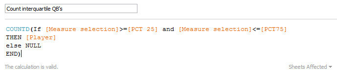
Since median was already available and total QB’s was easily done by COUNTD(Players), only challenge was to count the QB’s in the IQR. I calculated those by the following calculation.
This made me very happy :)
Leaving formatting for the end, I moved on to the legend. I noted that I could use the percentile and median calculation for creating similar looking legend. But do I really need to do the calculations again? Since I don’t want the legend to be dynamic, just a similar looking distribution bar, I opted to do it without any calculations. And I ended up with pretty neat legend all decked up with annotations.
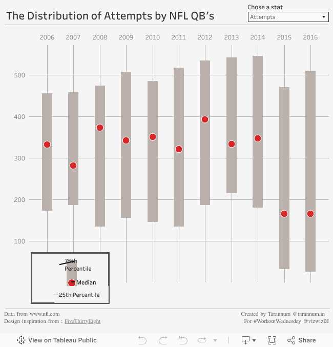
I had a well functioning dashboard now. Only formatting remaining. ONLY.
Stuff which was easy:
- Overall color of the dashboard, borders, placing the legend
Stuff which was crazy:
- Placing a very thin, shaded, floating text box as the line below the Heading. That was the only way I found. Another way was to use an image of a line, which is way crazier.
####Stuff which took a LONG time to figure out:
- Columnar grid lines. I was getting grid lines that were on either side of the bars and not directly under the bars. But why? was it really a box and whisker plot ?? Those lines sure look like extended whiskers. I did try to make a box plot again and extend their whiskers but no use. It is not a box plot. Period. After staring at the year dimension for very long time i realized that it was discrete. I converted it to dimension and voila!! Success.
- Putting the year header on top. That took some workaround. Copying the Year dimension on column, making it dual axis and removing the axis tick marks for the bottom axis.
####Stuff for which I broke my head but could not figure out and had to look at Andy’s dashboard:
- Removing the 2005 and 2007 labels from the x-axis. Andy’s dashboard also looked the same. No difference in year dimension. Same axis settings. A lot of looking around revealed that the culprit was data type for Year. Mine was set to “Number(Whole)”. As I changed it to “Number(Decimal)” everything was in place. I don’t completely understand why that made a difference. To learn later.
With that, I finally completed the dashboard. Hopefully I’ll use the custom font next time.
Blogging about the exercise was quite fun. I hope to do it every week and make Workout Wednesday a valuable learning exercise.
tableau WorkoutWednesday distribution-bands